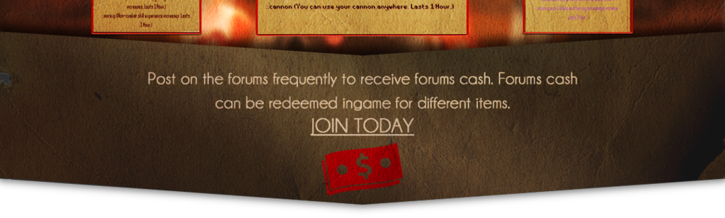
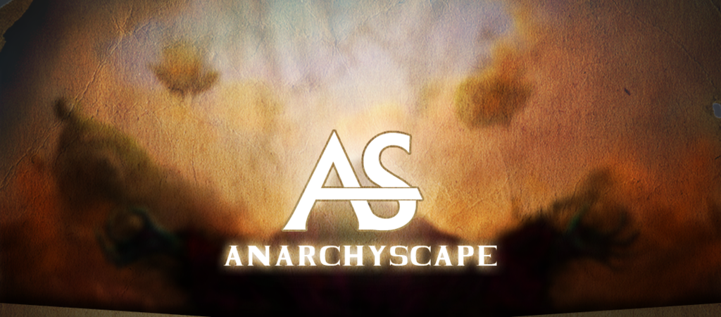
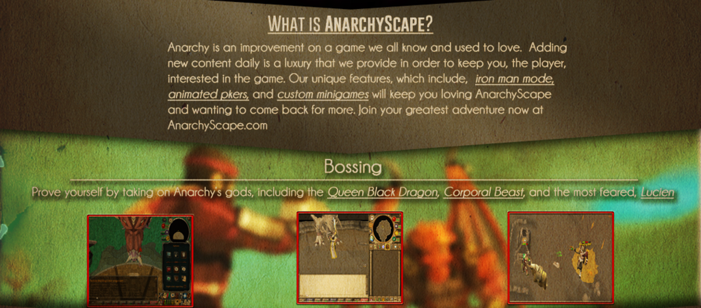
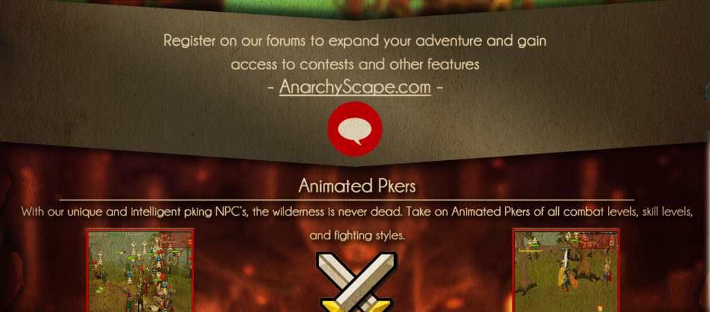
I am not advertising for this server I am posting this purely for feedback (which seems to be lacking lately). This is my first ad banner ever so let me know how to improve.
[CENTER]
[/CENTER]

I am not advertising for this server I am posting this purely for feedback (which seems to be lacking lately). This is my first ad banner ever so let me know how to improve.
[CENTER]
It looks pretty cool to be honest, but the glow for the title seems a little bit too much? If you get what I’m trying to get across.
Yeah across where it says ANARCHYSCAPE. I’ll try to dim that down in the future.