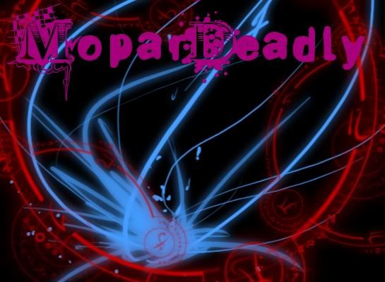
As i said, my first.
“If you don’t have anything good to say, don’t say anything.”
My first graphic
What is it for
I was going to use it for my signature but it’s kinda big. 
That’s pretty good for your first (: But yeah a bit big for a signature (; Also with the colors, I suggest picking better matching ones next time? And maybe rotating the blue thing a bit more clockwise and putting it in the bottom left corner  Just a thought, pay no attention to me (: Other than that good job! c:
“If you don’t have anything good to say, don’t say anything.”
Why did you post this here if you don’t even want criticism? Honestly, it’s horrible. The graphics don’t go together, the colors are awful, and the font looks like shit.
Crop it to signature size and choose a different font 
[quote=“Cole1497, post:5, topic:428356”]“If you don’t have anything good to say, don’t say anything.”
Why did you post this here if you don’t even want criticism? Honestly, it’s horrible. The graphics don’t go together, the colors are awful, and the font looks like shit.[/quote]
there is a difference between negativity and criticism, friend.
tbh, its not bad. better then my first.
I’d have been far more amused if everyone took his advice and this topic just remained empty of replies.
The work shows that you may be on the right track; I think. I can’t really tell if you changed any effects or if it’s all just brushes and a render. If it’s the latter then you’ve not a clue what you’re doing.
